
A Web App for Design Assets Curation
Vibe Code Design – Simplifying Design Asset Management
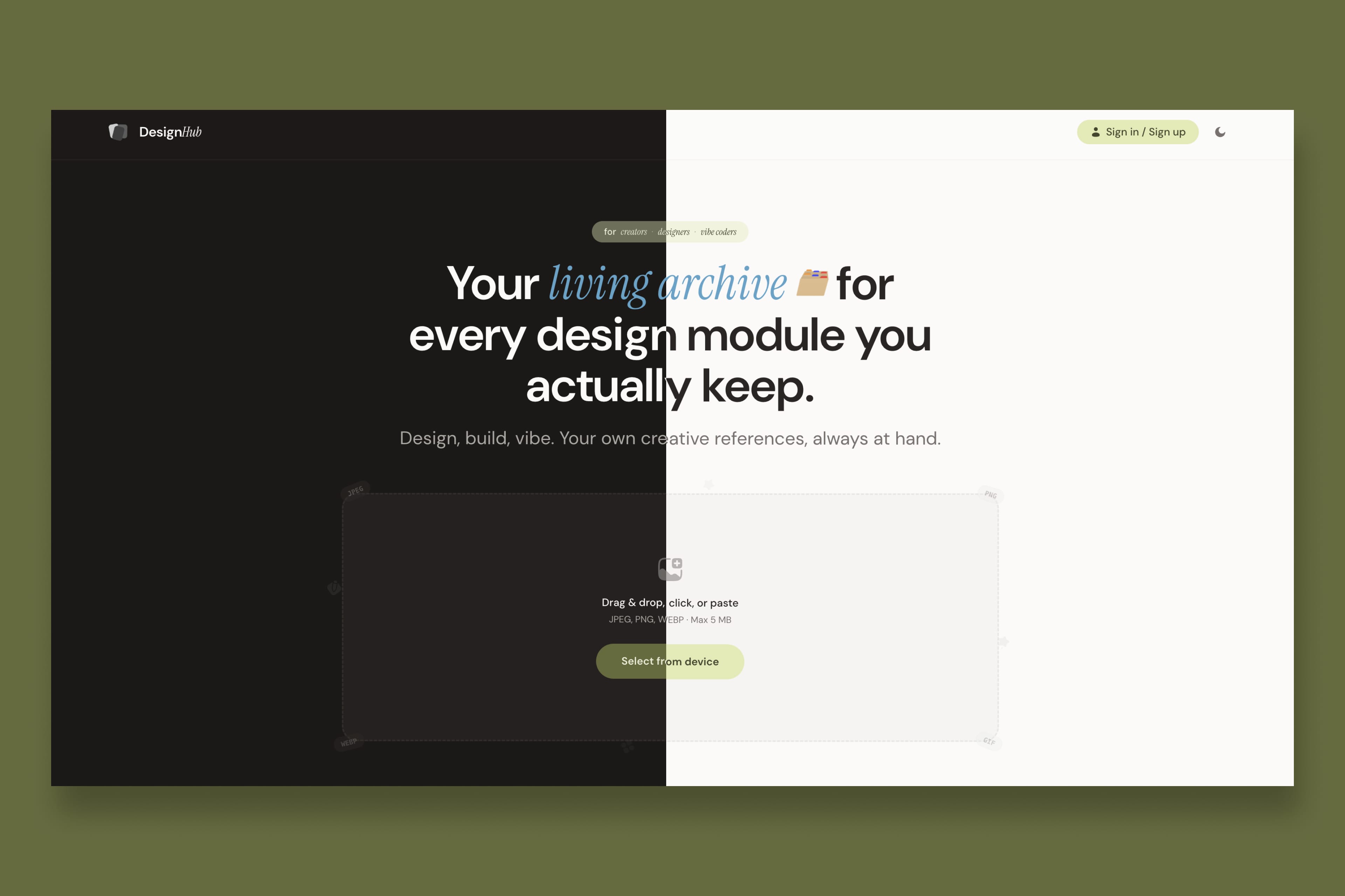
As a UI/UX designer juggling reference screenshots, UI kits, and project assets across Google Drive and random folders, I kept losing the “good stuff” I wanted to reuse. Design Hub is a minimal web app that turns those scattered design assets into a curated, searchable gallery with clean, editorial UI.
INDUSTRY
Management Tool
ROLE
Branding, UI/UX Design, Vibe Code
TOOLS:
Replit | Figma
Design Problem
Project Objectives:
Project Objectives:
Design Process
1. Goals
2. Users and insights
Primary users:
Designers and creators who collect reusable modules (UI kits, brand systems, motion references).
Bilingual designers (Chinese/English) who label files in both languages.
Key insights that shaped the product:
Finding matters more than storing. People will store anything if they trust they can find it again.
Visuals first. A thumbnail gives instant context and reduces the need for long descriptions.ixdf
Language is metadata. Chinese and English titles act like tags, so search must work across both.
3. UX approach
Information architecture
I framed the app around a single, simple object: the template card.
Each card includes:
Thumbnail image
Chinese title (primary)
English title (secondary)
Google Drive folder URL
On top of that, I designed core flows:
View templates in a responsive gallery grid
Add a new template via form
Edit / delete an existing template
Search by Chinese or English title
Open associated Google Drive in a new tab via clear, clickable card behavior
Interaction design
To keep the experience light and focused:
The main screen is a gallery grid, not a table or dashboard.
Cards behave like large, clear buttons: hover reveals subtle depth; click opens the Drive folder.
A single entry point (button/trigger) opens the add/edit panel, so the user always knows where to go.
Design Process
Visual & UI design
The visual direction: minimal, editorial, elegant.
Key decisions:
Layout: Generous whitespace, centered content blocks, and a clear visual hierarchy of headings, body text, and captions.
Color: Neutral palette with subtle borders and soft hover states to avoid dashboard-heavy or marketing-style visuals.
Typography: Modern sans-serif typography with clear contrast between Chinese and English titles to support scanning.
Hover interactions: Gentle shadow/scale to indicate clickability without feeling flashy.
The result is an interface that feels more like a design magazine grid than a SaaS dashboard, aligning with the idea of a “living archive” of design modules.
Key features and flows
Gallery and empty state
Templates are shown in a responsive grid that adapts to different viewports, ensuring cards maintain polished proportions.
When there are no templates, the app shows an empty state encouraging users to add their first card instead of a blank screen.
Add / Edit template
A modal or side panel hosts the form to reduce context switching:
Fields: Thumbnail upload, Chinese title, English title, Google Drive URL.
Validation:
All fields required.
URL validated as a proper link; clean inline error messages appear directly under the field.
Preview: Image preview before saving helps users confirm they selected the right file.
This keeps the form focused and avoids overwhelming users with unnecessary options.
Search and filtering
A search field filters templates by matching text in either Chinese or English titles.
Filtering feels smooth and instant, reinforcing the sense that the gallery is a quick-access library rather than long-term storage.
Open in Google Drive
The entire card and/or a clear action area opens the Google Drive folder in a new tab.
This is the core value: the gallery acts as the “front door” to the underlying file system.
Outcome
This version of Design Hub achieved:
A clean, scannable gallery that makes design assets feel curated instead of cluttered.
Fast CRUD flows for bilingual template cards, with inline validation that keeps errors visible but unobtrusive.
A UI that feels like a deliberate design artifact—minimal, editorial, and easy to extend in future iterations.
What I learned:
Constraint helps clarity. Focusing on a single core object (the template card) made interaction decisions simpler and more consistent.
Bilingual support is a design decision. Designing Chinese as the primary line and English as the secondary line affected hierarchy, line length, and typography choices.
“Calm tools” stand out. In a space crowded with dashboards and feature-heavy tools, a quiet, purposeful UI can be a differentiator.
Next steps
If I take this further, I’d explore:
Tagging and collections for grouping assets by project or category.
Keyboard shortcuts for power users (quick add, quick search).
Integrations with Figma or other design tools for faster clipping and saving.
Richer analytics around which assets are reused most often.