
MENUSIFU
Web Design - Online order portal
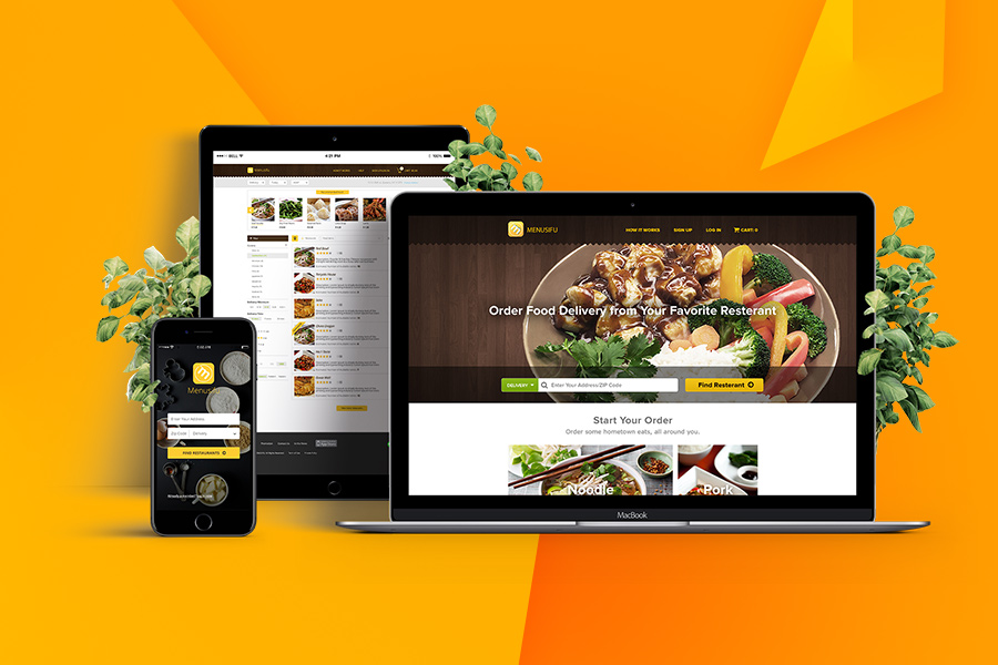
Menusifu is a company focused on providing the next generation of intelligent systems for the catering industry, it defines itself a combination between food, tech, and life. It utilizes a POS system that brings menus to life and makes the order process more convenient, easier, and faster.
This project is a responsive web design of a B2B self-order CRM system (both online ordering portals and mobile self-order portals) to allow the customer to order remotely from either their laptops or phones for dine-in, delivery or pickup services in real-time, as their personal kiosk.
INDUSTRY
Self-service kiosks, retail restaurant
ROLE
Branding, UI/UX Design, Web Design/Dev
TOOLS:
Axure RP | Adobe PS
Web Design - Online order portal
Menusifu
Menusifu is a company focused on providing the next generation of intelligent systems for the catering industry, it defines itself a combination between food, tech, and life. It utilizes a POS system that brings menus to life and makes the order process more convenient, easier, and faster.
This project is a responsive web design of a B2B self-order CRM system (both online ordering portals and mobile self-order portals) to allow the customer to order remotely from either their laptops or phones for dine-in, delivery or pickup services in real-time, as their personal kiosk.
Software: Axure RP, Adobe PS
Design Problem
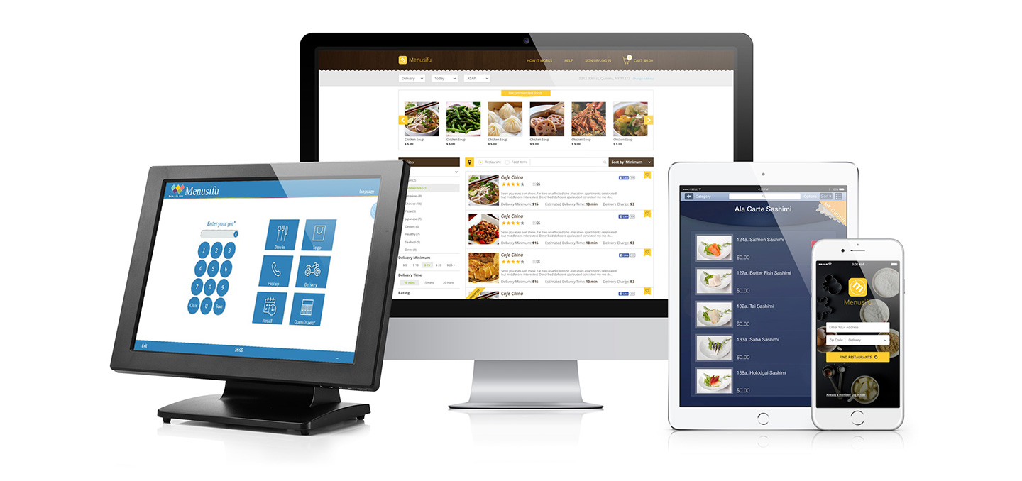
Business Goal
Menusifu offers a conduit between restaurants and customers. Through their service, customers and restaurants can be provided with many useful features such as displaying beautiful pictures with prices, reviews and ranking information and fashion user experience brought by touch-screen ordering while serving. With Menusifu POS system, orders could be processed very fast. However, we have observed that one critical factor a!ecting customer satisfaction is whether they are ordering online and how they can manage their account online. Currently, customers came to the restaurant, ordering food, eat and leave, restaurants have a low turnover rate. A more customized eating experience should be provided, no matter in the restaurants or outside the restaurant. How to improve the e#cacy of their communication products, thus making restaurants as service providers more successful and competitive in their market and the customer more satisfied with the service?
As a B2B e-commerce marketer, in order to increase their sales and strengthen customers/clients relationships, Menusifu’s current market strategy is to"launch an online food ordering platform providing catering service experience, thus convert more restaurants as service providers and potential business customers to their business.
Therefore, Menusifu was considering revamping their business model to create a self-order CRM system (both online ordering portals and mobile self-order portals) to allow the customer to order remotely from either their laptops or phones for dine-in, delivery or pickup services in real time, as their personal kiosk.
Design Process
User Research
Target Users:
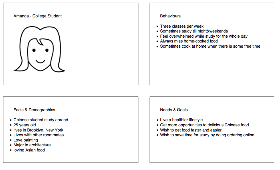
- Young Chinese customers in the US.
- Chinese tourists who are currently visiting the US.
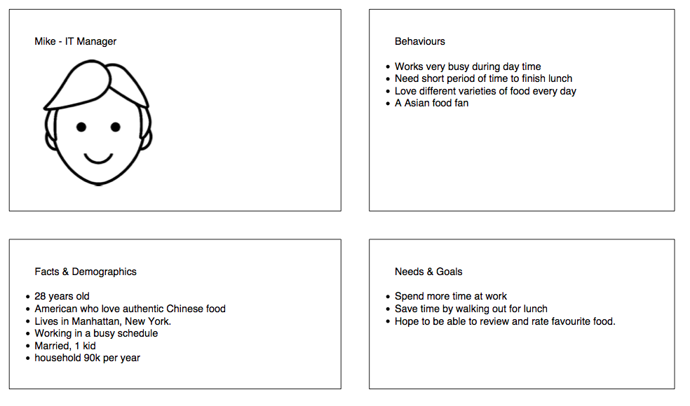
- Busy office workers/managers who don’t have time out for lunch.
- American customers who love Authentic Chinese food.
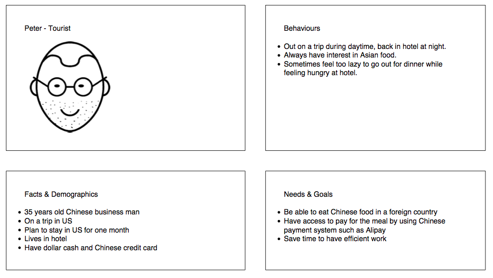
Persona analysis
Competitor Analysis
Menusifu online order allows hungry customers to order directly from the restaurant’s website. Menusifu’s online ordering portals are all-inclusive for restaurants. From tempting food photos to a simple customizable order page, The online order system makes it easy for your customer to fulfill their desires. There are many other competitors in the US market. One group could be defined as online ordering platform such as Seamless, Eat24, Delivery.com, and UberEATS; while another group could be defined as IT POS system competitors such as LAVU, NCR silver, Shopkeep, advantech, FotoDish (App), intuit payment, etc. We found that although other online self-order competitors did great jobs on their UX design among the market, Menusifu has its holistic service. Since Menusifu’s main target audiences are Chinese, besides Apple Pay, Google Wallet, and Android Pay, the integration of WeChat Pay and Alipay also attracts many Chinese who are currently visiting USA, no matter on a business trip or as tourists.
Hypotheses
We will create several features for those personas in order to achieve a more convenient, faster checkout experience.
Those features should be included:
- Clean, minimized order page
- Easy to edit, customizable dashboard
- Re-order function in dashboard
- Review & Rating function
- Loyalty Program management
- etc.
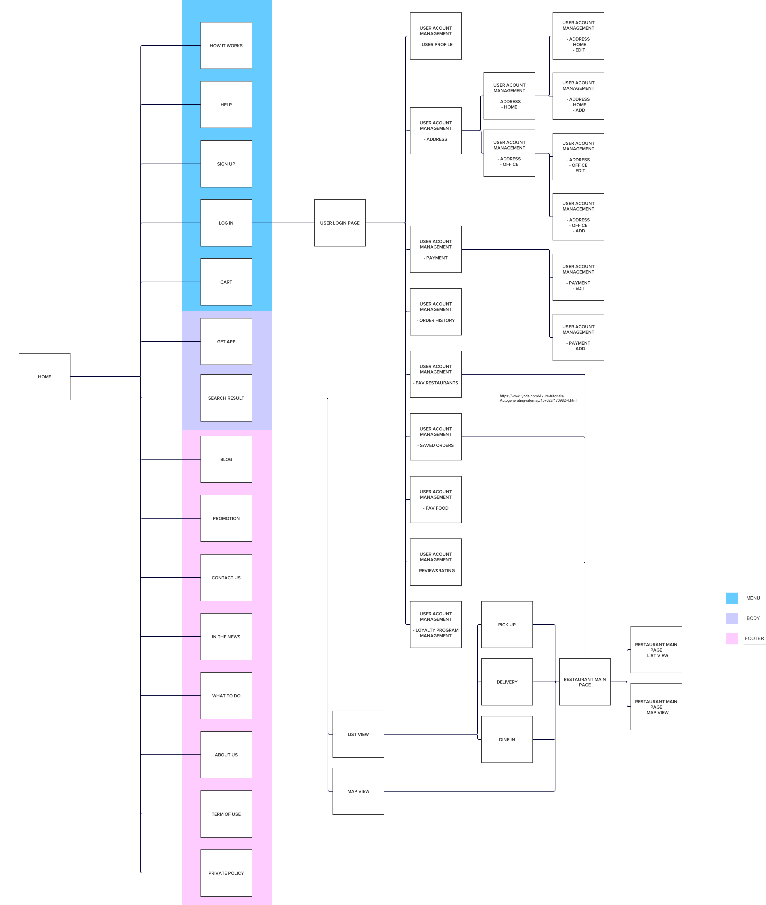
Information Architecture
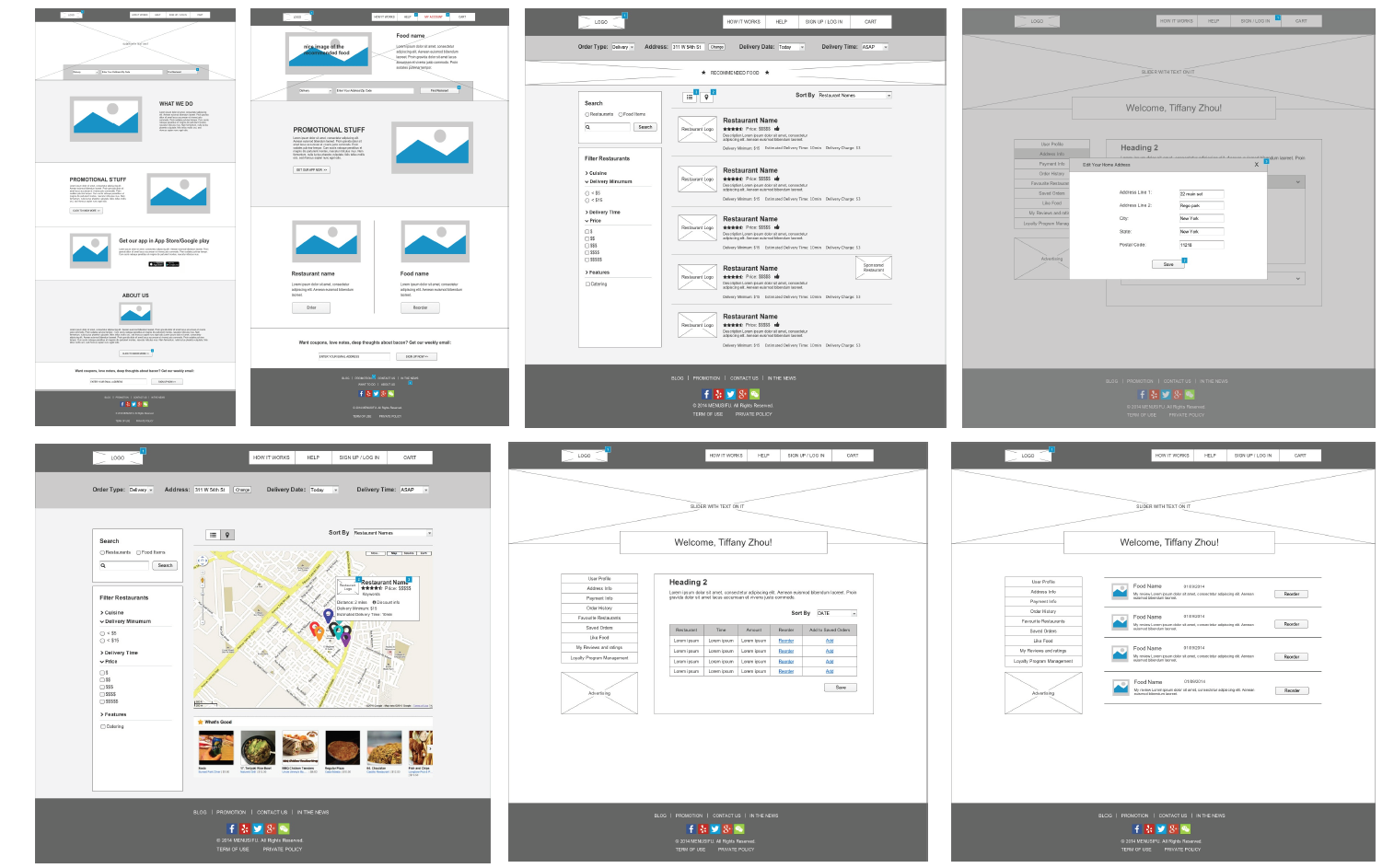
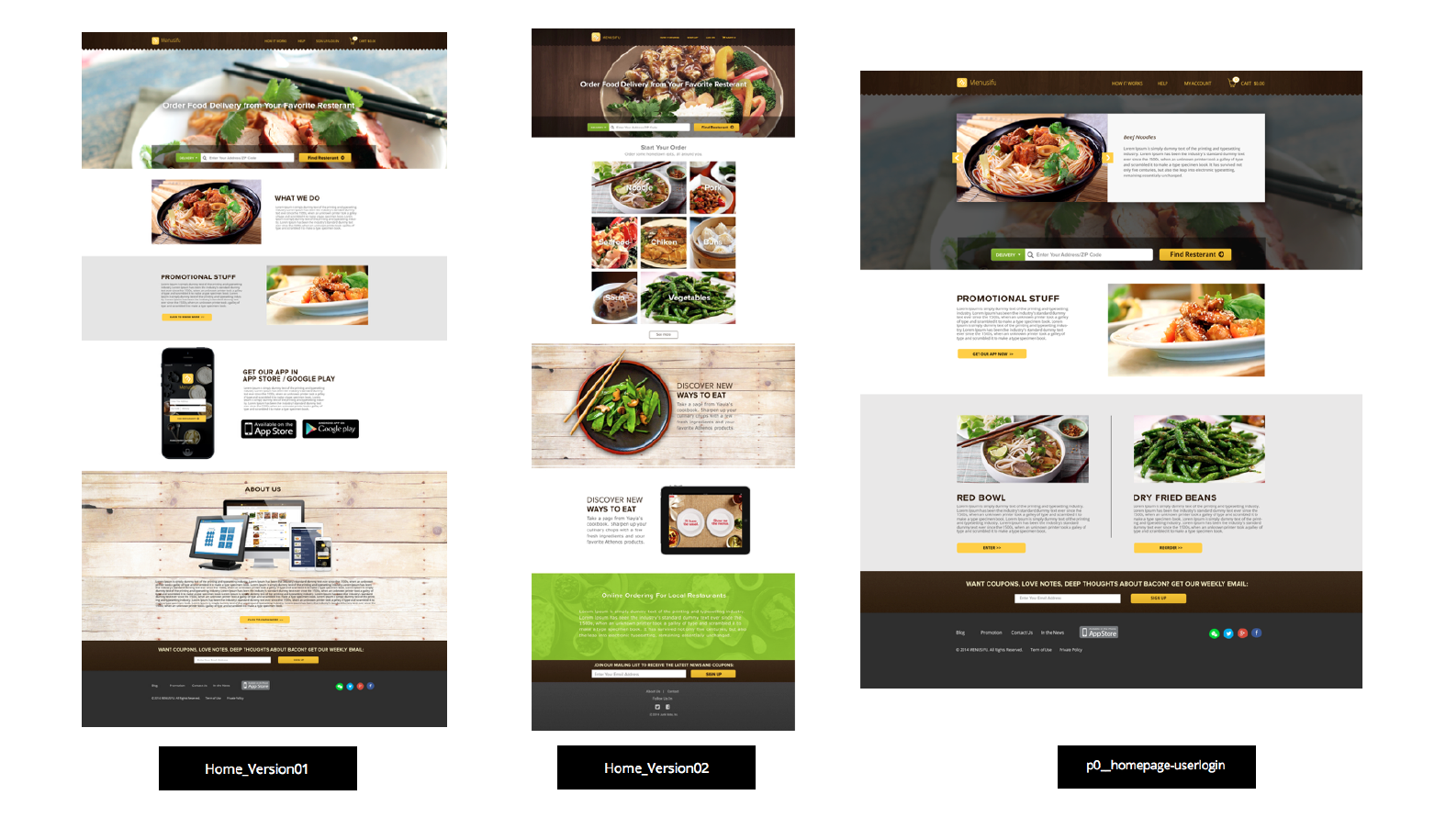
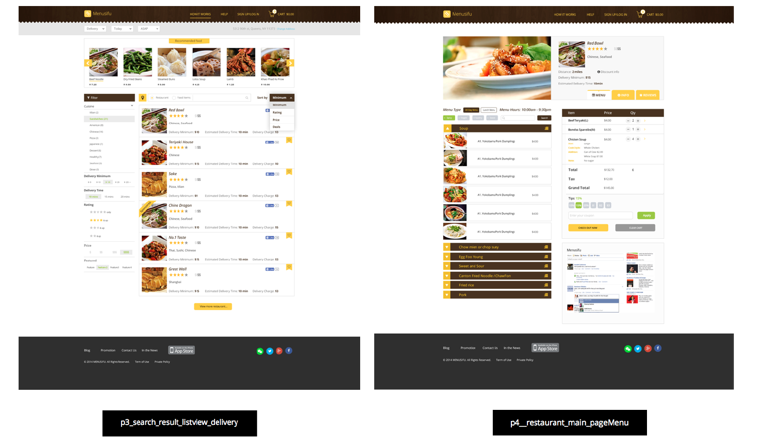
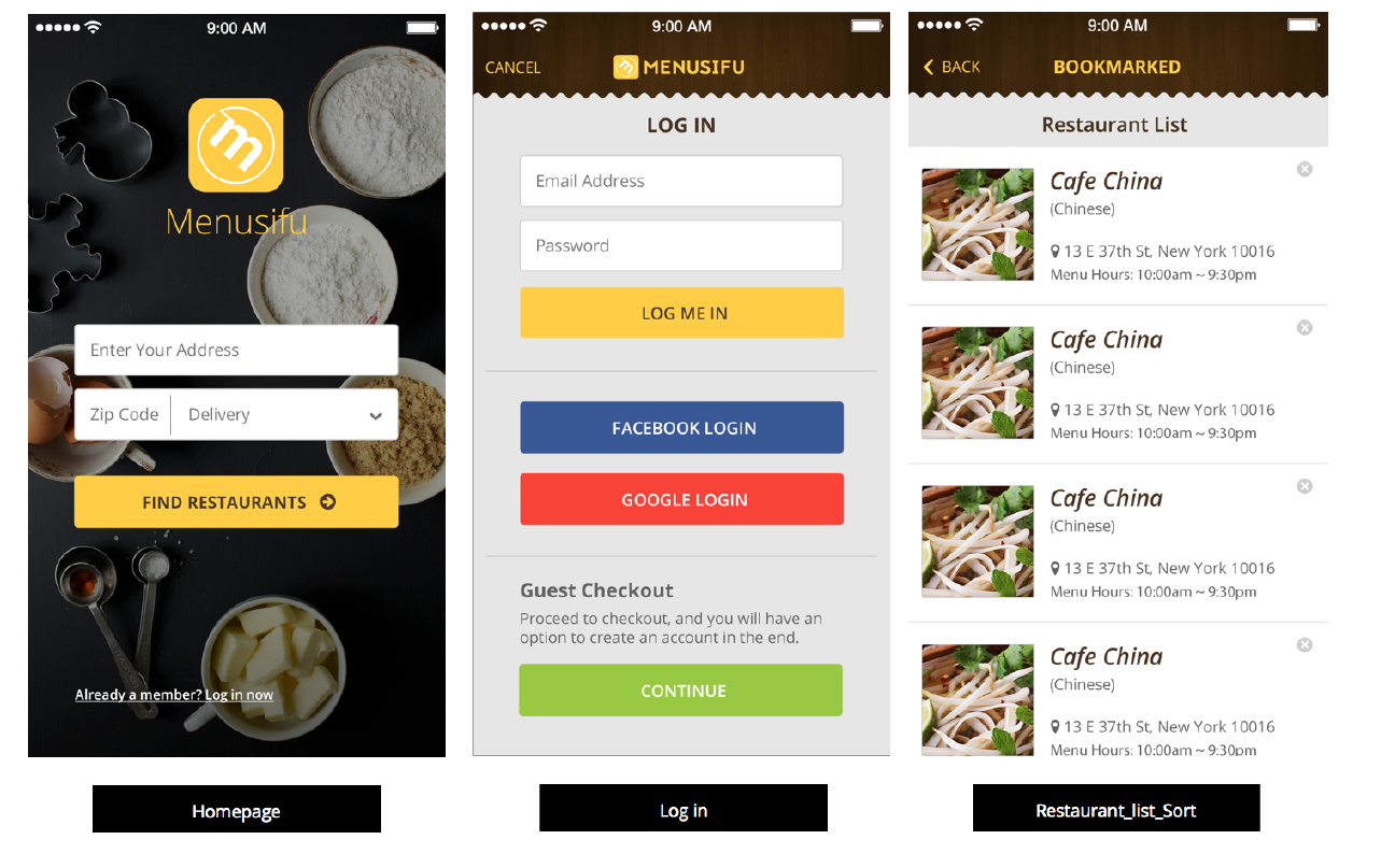
UI screenshots
Desktop
Mobile
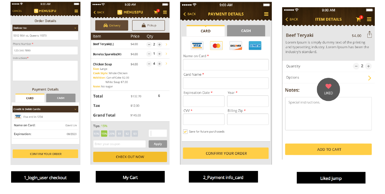
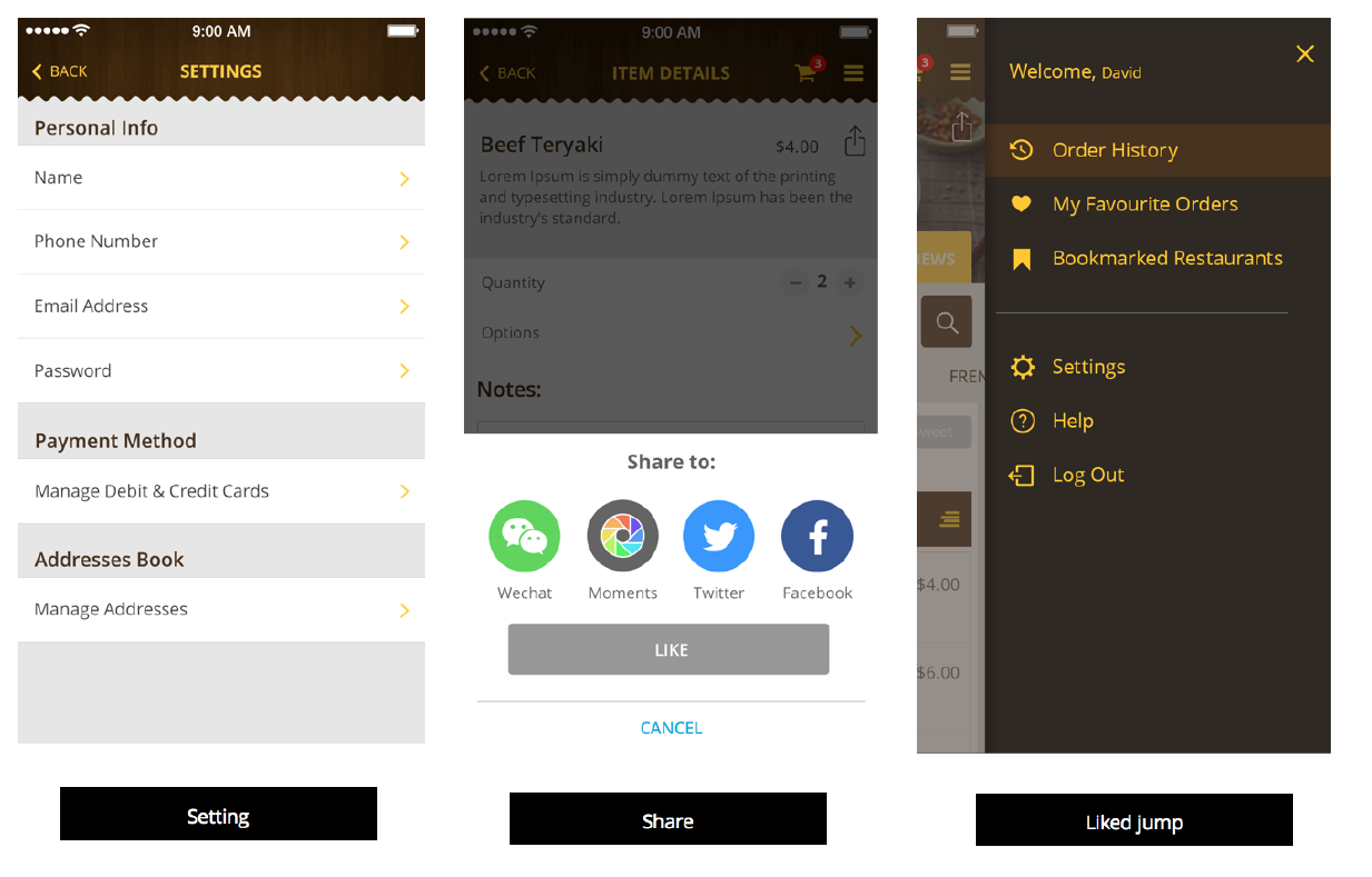
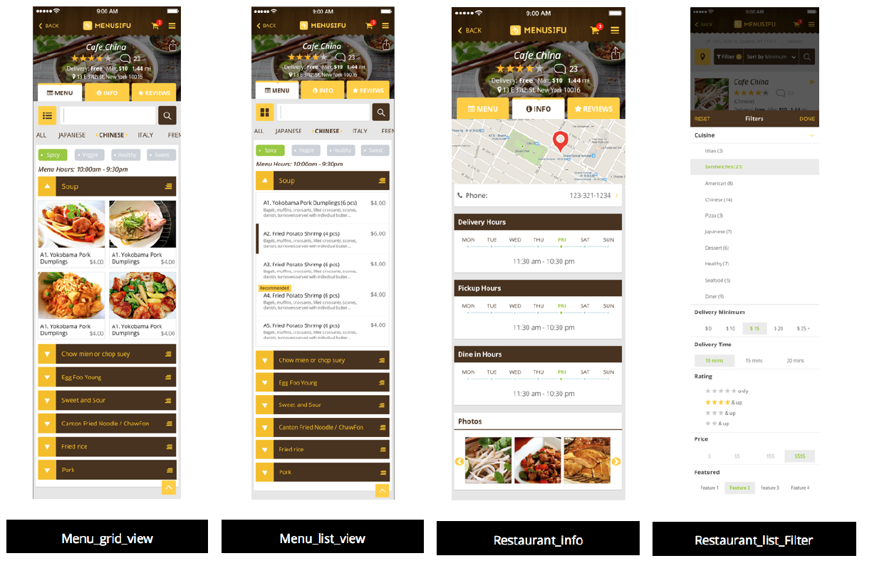
display

Design Problem
Project Objectives:
Background Research:
The client shared several reference websites, including Klarity Health, DesignJoy, and Legency Webflow. These examples helped define the visual and strategic direction for the redesign — a look and feel that is clean, confident, and conversion-focused.
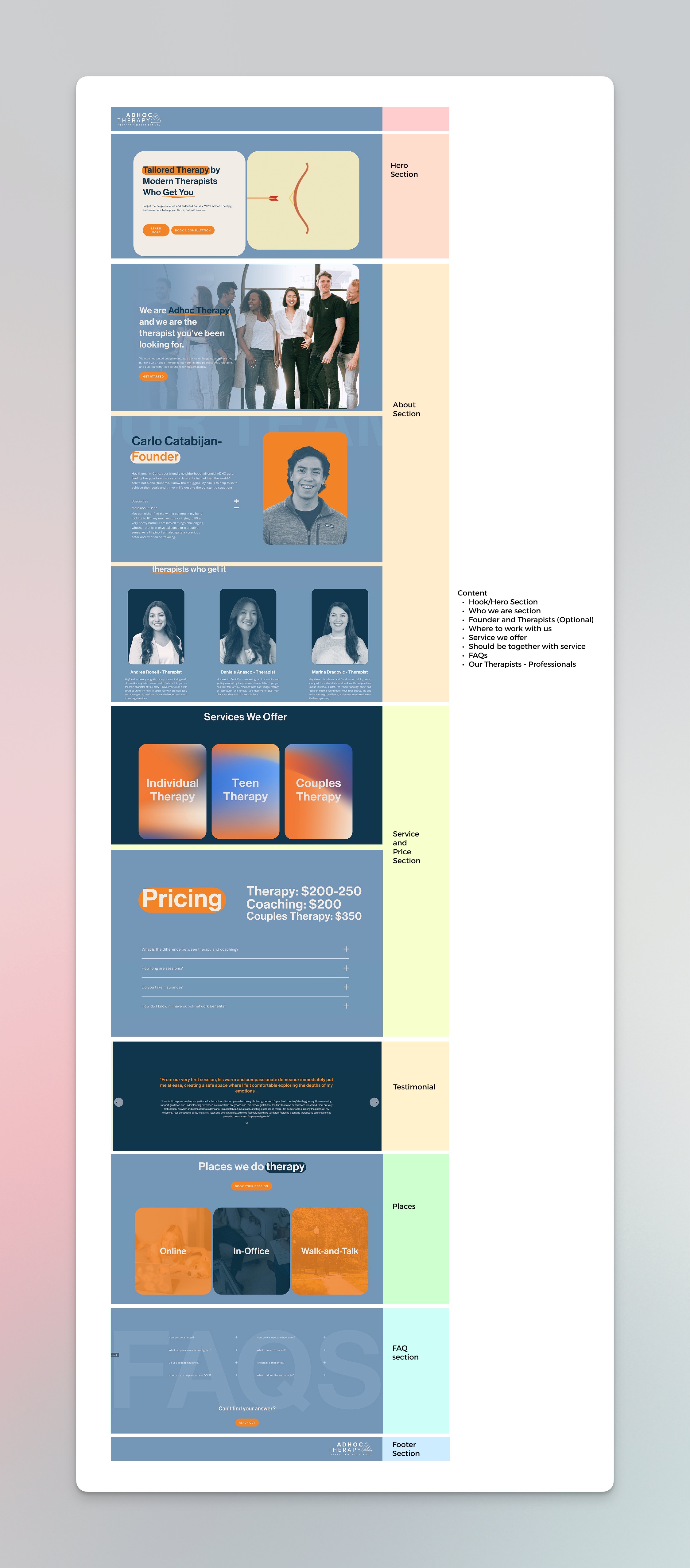
To begin the process, I carefully analyzed each section of the original site to determine which elements were essential to retain and which could be simplified or restructured. This evaluation allowed me to refine the content hierarchy, improve the overall flow, and create a more intuitive user experience that guides visitors naturally toward the primary goal: booking a session.
I identified the key sections most relevant to his current business and presented my strategy for redesigning the one-page website.
Design Process
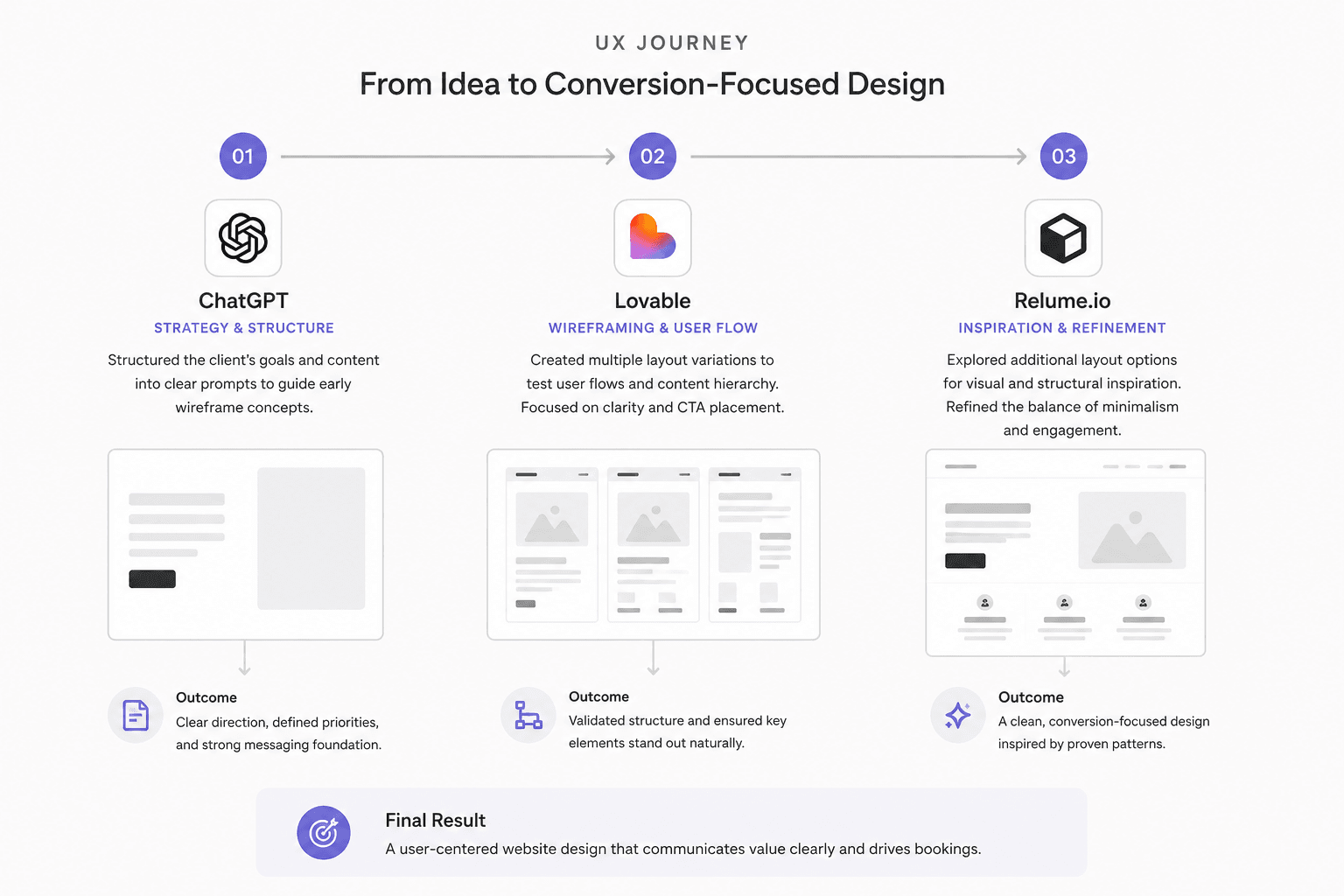
1. Initiated Concept Exploration with AI Tools
Old site analysis:
2. Design in Figma
Once the direction was finalized, I moved into high-fidelity mockups in Figma. This stage focused on blending simplicity with warmth, ensuring every visual element—from typography to spacing—aligned with the brand’s tone and enhanced readability. The design emphasized modern aesthetics while keeping a friendly, approachable feel suited to a therapy practice.
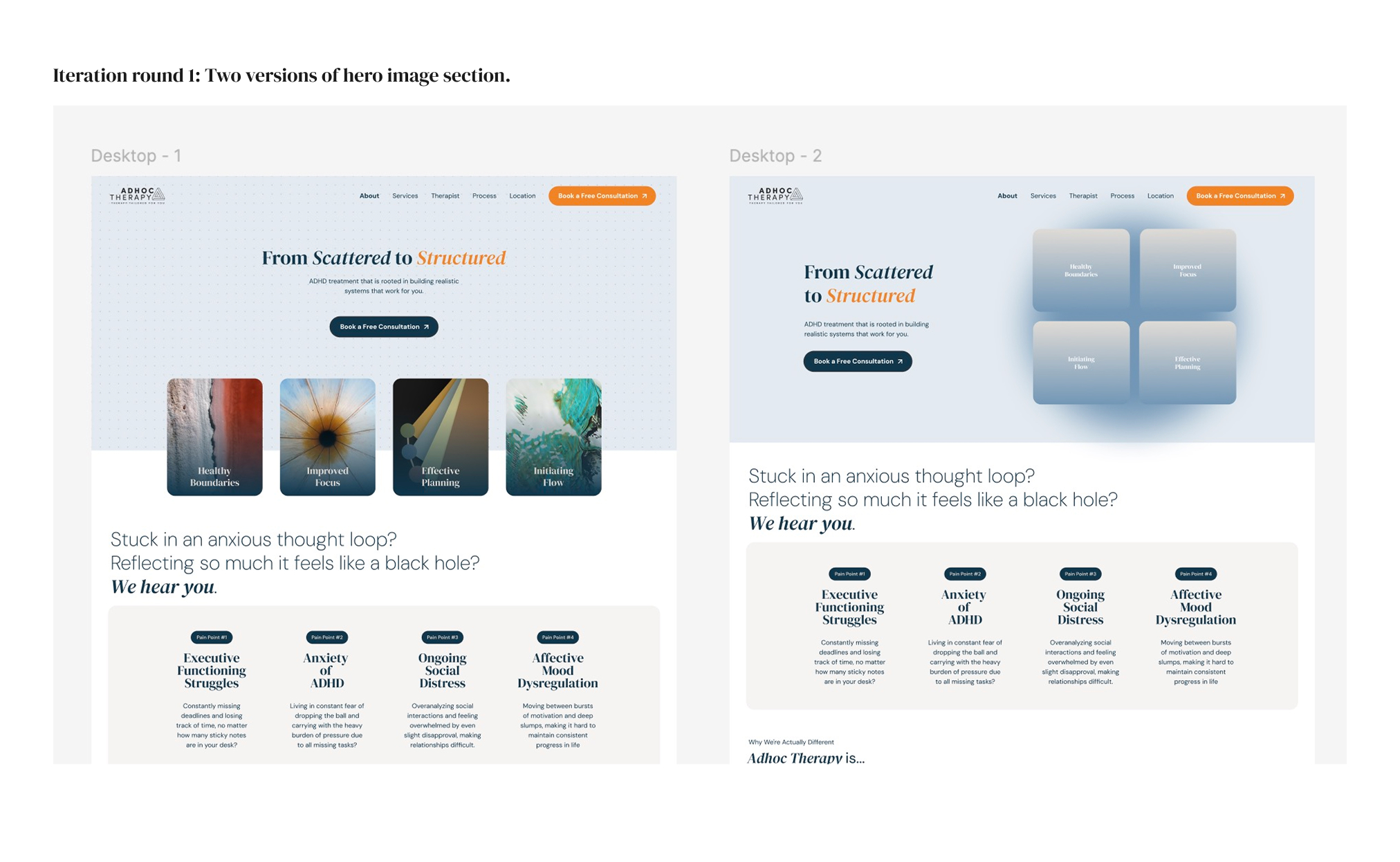
Iteration round 1:
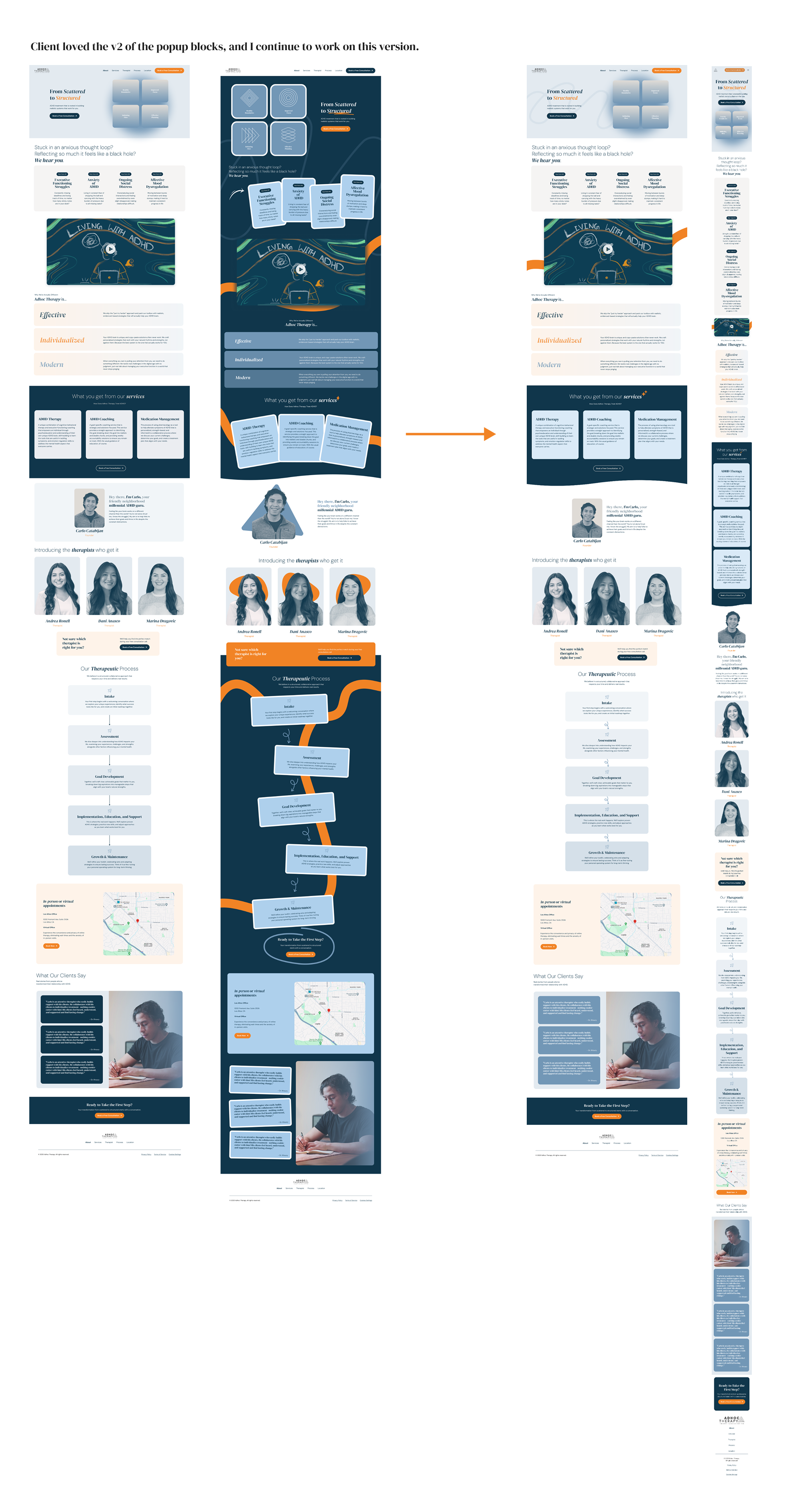
I provided two design directions: one with an art-focused concept featuring related imagery in each section, and another following a clean, minimal corporate style.
Iteration round 2:
- Version 1 – Minimal & Professional: Clean and corporate design. The client appreciated the structure and scalability but wanted more creativity.
- Version 2 – Creative & Playful: Introduced flowing backgrounds and soft visuals. The client loved the energy but found it too complex for Squarespace.
- Version 3 – Hybrid (Final): Combined the professionalism of v1 with the creativity of v2. Included both desktop and mobile versions for full clarity — this became the approved direction.
Final Version - Included both desktop and mobile responsive designs, while also taking into account the limitations and customization capabilities of the Squarespace platform.
3. Development in Squarespace
Finally, the project entered Squarespace development, where I implemented the approved design into a fully responsive one-page site. The build included SEO-optimized structure, anchored navigation for smooth scrolling, and a cohesive visual flow across all devices. The result was a polished and user-centered website that feels modern, trustworthy, and easy to navigate.
The design phase began with defining a consistent color palette and typography hierarchy to create visual harmony and strengthen brand recognition. Every element—from headings to buttons—was aligned to ensure clarity and balance across the layout.
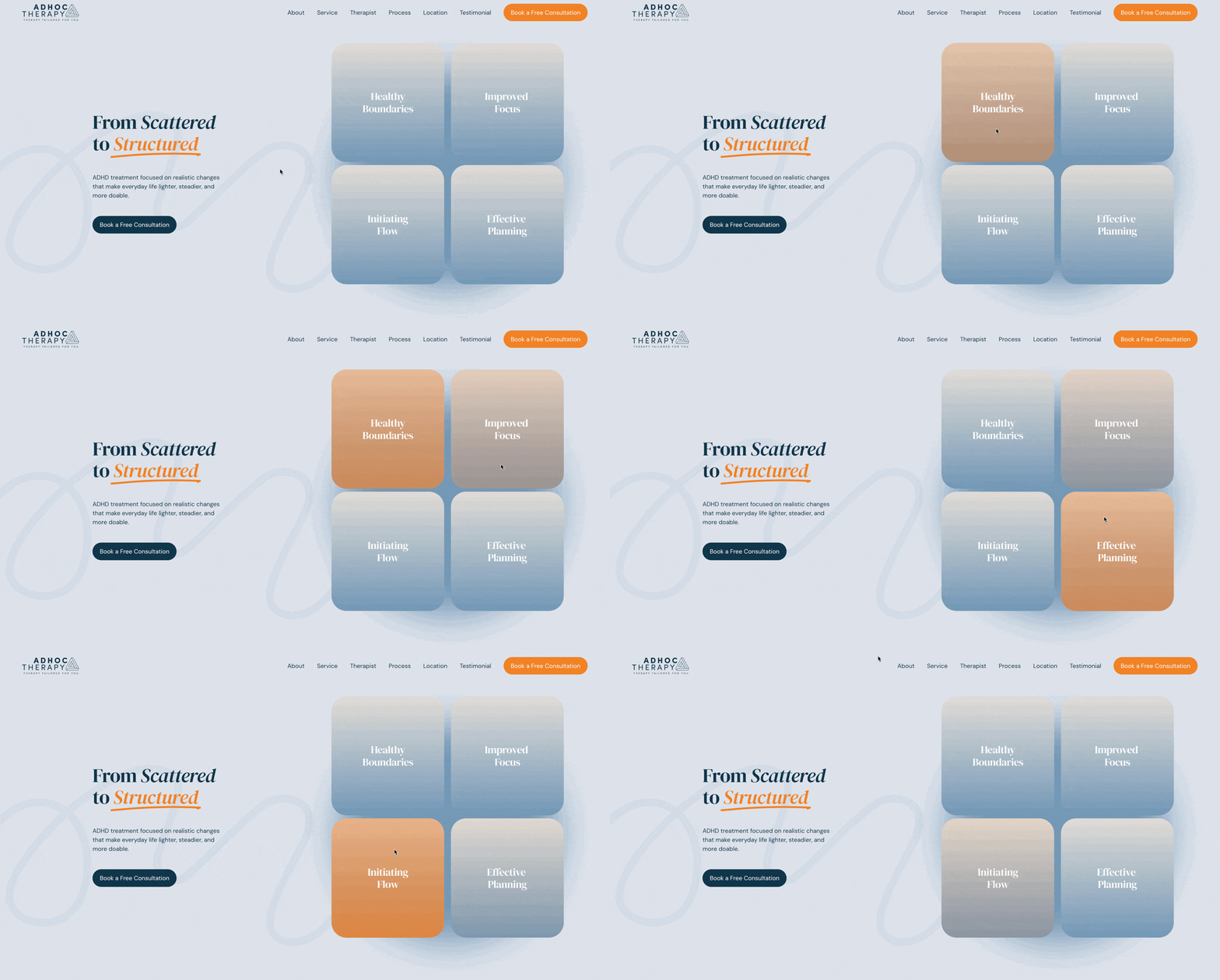
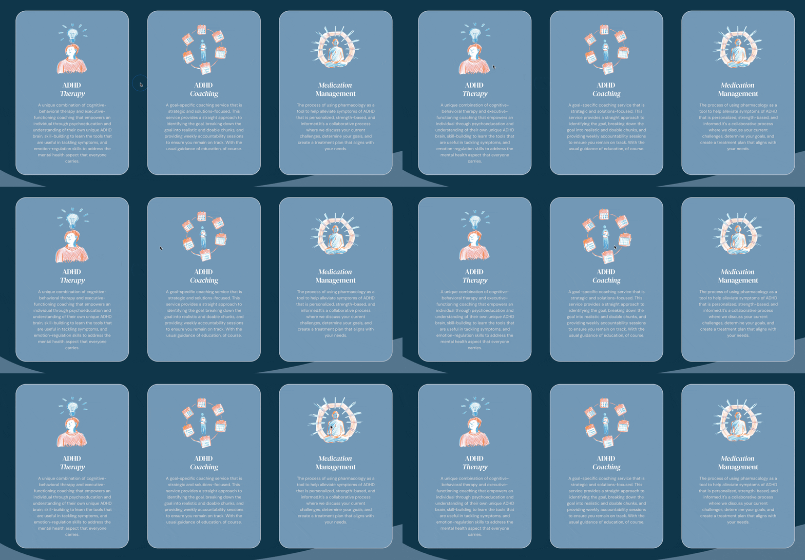
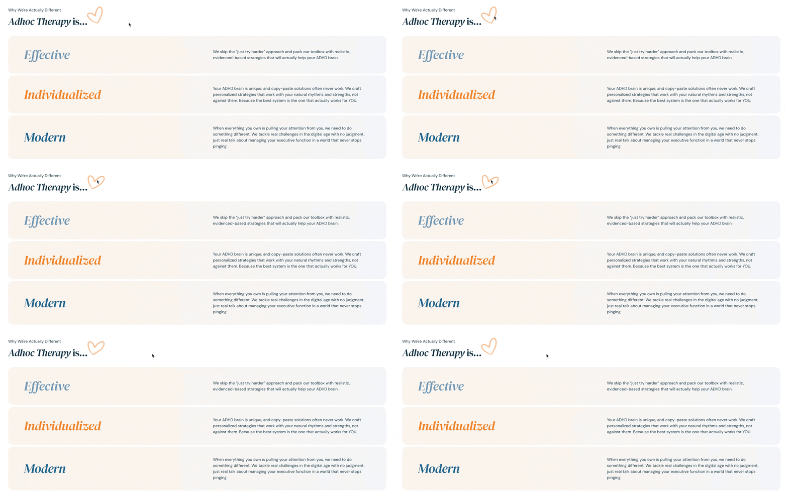
To enhance interactivity, I added custom CSS using Squarespace ID Finder, introducing subtle hover effects and smooth transitions that bring the interface to life without overwhelming users. These small animations added polish and made the experience feel more dynamic.

Design Process
Desktop Homepage:

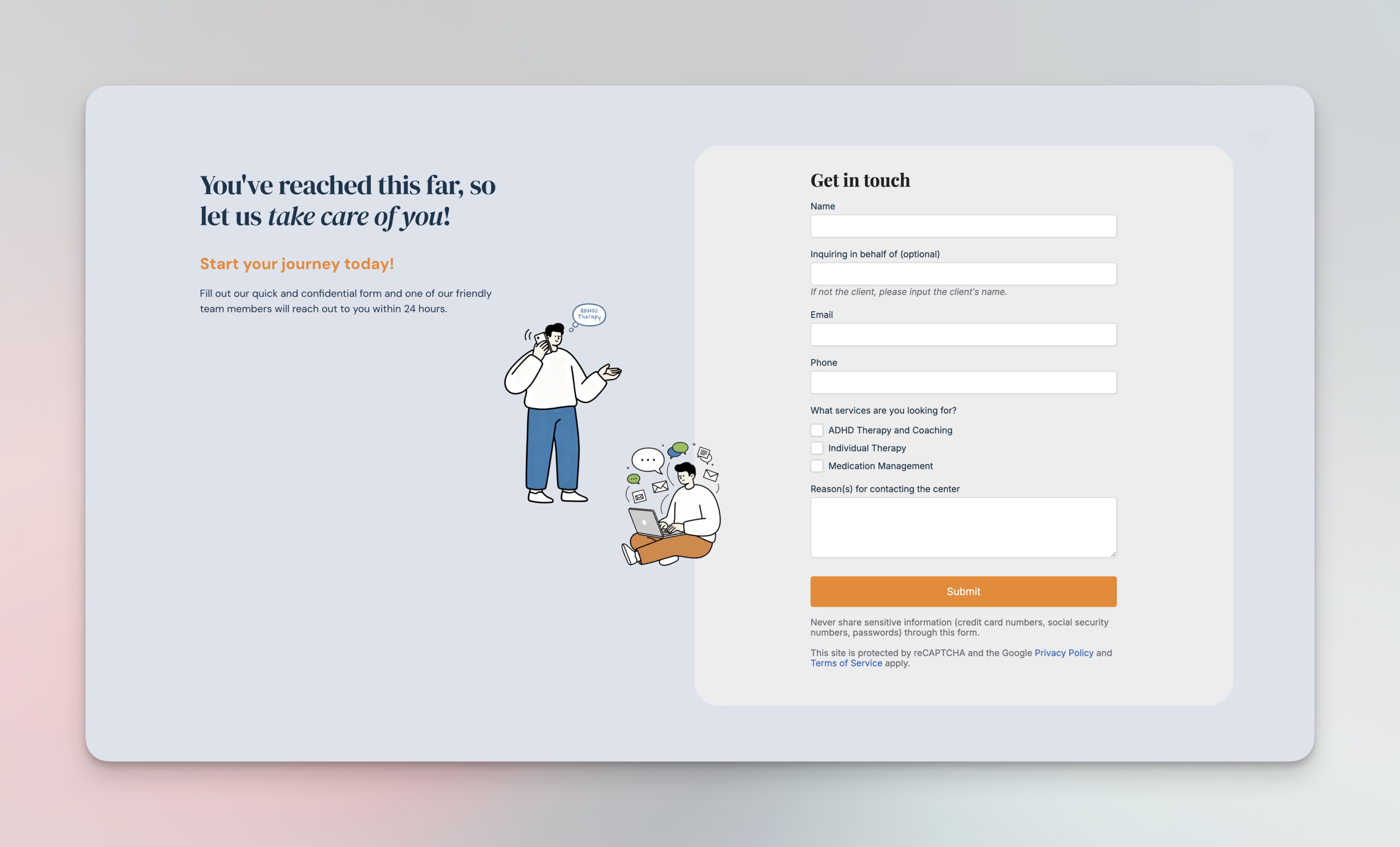
Desktop Contact Non-scroll Page with PipeDrive booking form embeded:
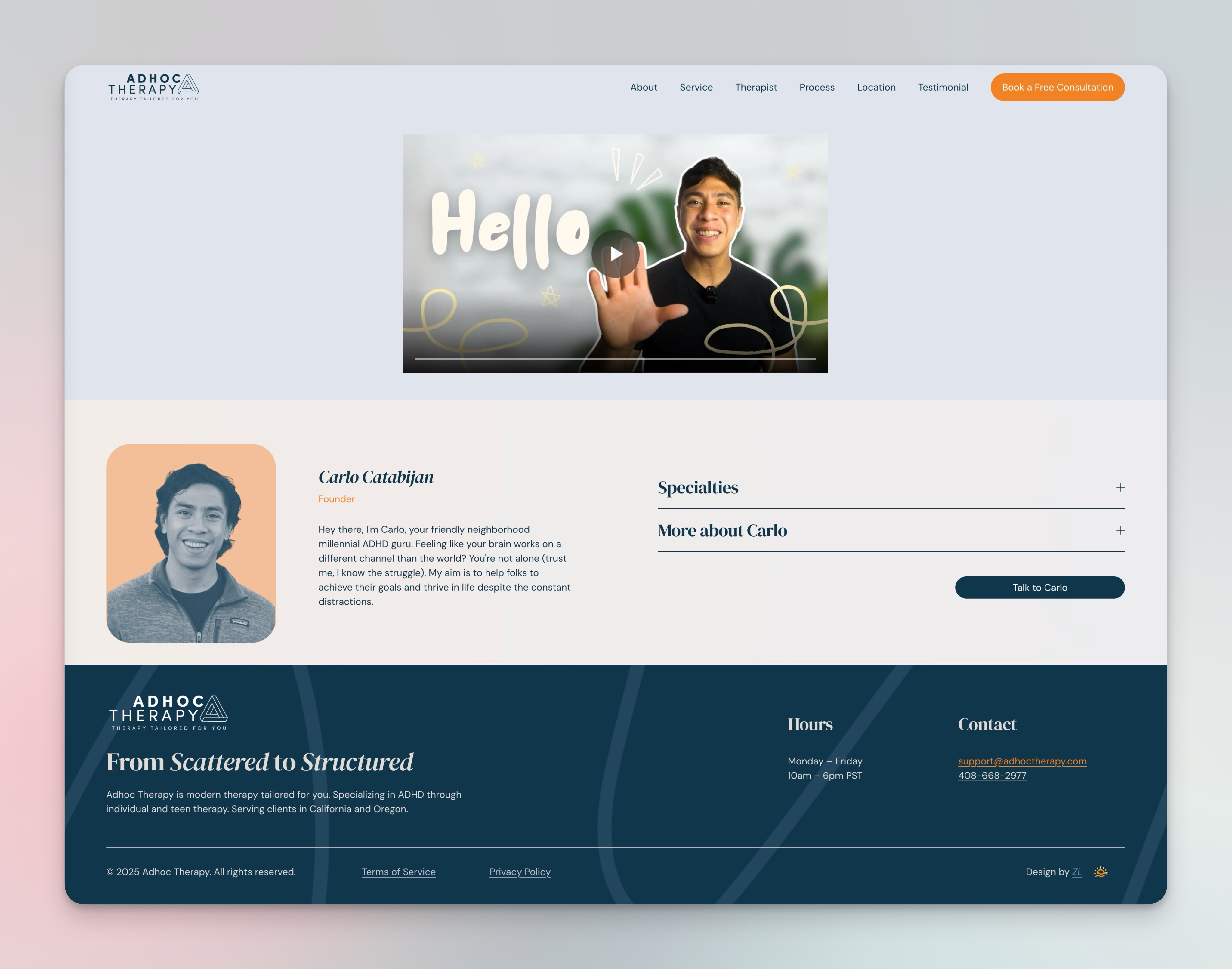
Individual Therapist Non-scroll Page:
Outcome
The redesigned Adhoc Therapy site is modern, minimal, and emotionally approachable. It strengthens the client’s credibility, improves usability, and focuses the user journey toward booking a session. The client was especially pleased with the visual execution and the AI-generated illustration that brings warmth to the contact section.
The final result delivers a cohesive online presence that reflects Adhoc Therapy’s mission — supportive, trustworthy, and clear.